Mastering the Perfect YT Thumbnail Size for More Clicks
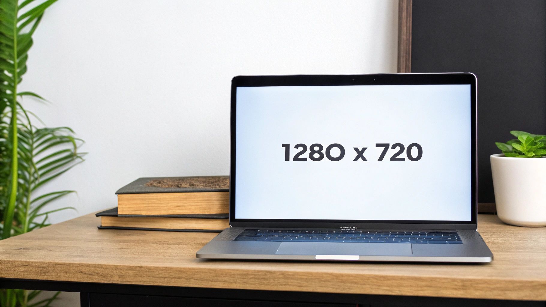
Let's get straight to it: the perfect size for a YouTube thumbnail is 1280 pixels wide by 720 pixels tall. This isn't just a random suggestion; it's the gold standard that ensures your thumbnail looks crisp and professional everywhere.
Your Quick Guide to the Perfect YT Thumbnail Size
Think of your thumbnail as the book cover for your video. In a sea of content, it's your first, and often only, chance to grab someone's attention. If that cover is blurry, stretched, or has weird black bars on the side, it immediately signals low quality. Nobody wants to click on that.
By sticking to the 1280 x 720 pixel rule, you're creating an image that's high-resolution enough for a big TV screen but also scales down perfectly for a tiny smartphone display. This prevents that dreaded pixelation and keeps any text or key visuals sharp and readable, which is absolutely vital.
The Technical Nitty-Gritty
Getting the technical details right from the start saves a lot of headaches later. To help you out, here's a quick reference table with all the key specs you need to know.
YouTube Thumbnail Technical Specifications at a Glance
| Specification | Requirement |
|---|---|
| Resolution | 1280 x 720 pixels |
| Minimum Width | 640 pixels |
| Aspect Ratio | 16:9 |
| File Formats | JPG, PNG, GIF |
| File Size Limit | Under 2MB |
Getting these specs right means your thumbnail will always upload correctly and display beautifully on the platform.
The core idea here is to start with a high-quality image that can be scaled down, not a small one that gets stretched and loses its sharpness. That’s why 1280 x 720 pixels is the magic number.
Understanding the relationship between dimensions and aspect ratio is key. If you're ever unsure, a handy tool like an aspect ratio calculator can confirm your image fits YouTube's strict 16:9 requirement.
A Little History Lesson
Believe it or not, this standardised format is a relatively new thing. Back in the day, YouTube's algorithm would just pluck a random, often awkward-looking, frame from your video to use as the thumbnail. It wasn't a good look for anyone.
Around 2010, YouTube set 1280 x 720 pixels as the official standard. It was the perfect compromise, offering fantastic clarity on all devices. They also set a minimum width of 640 pixels to ensure thumbnails were still legible on mobile phones, which was crucial as more and more UK viewers started watching content on the go.
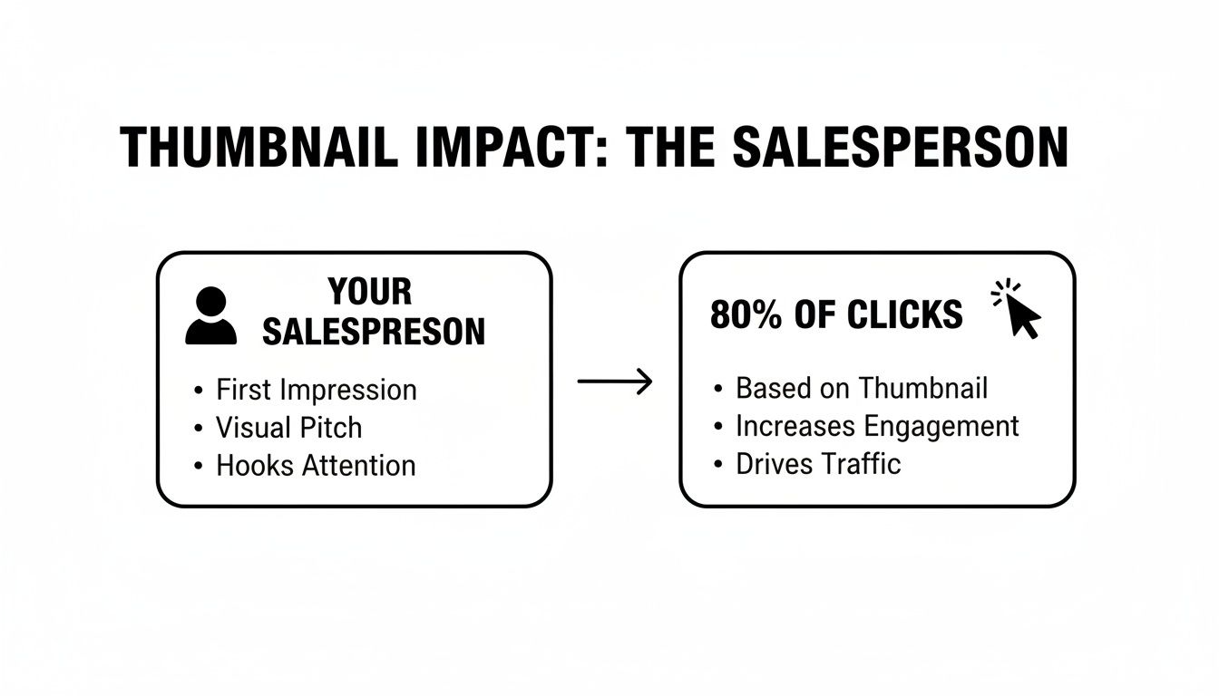
Why Your Thumbnail Is Your Most Important Salesperson
Think of your thumbnail as the silent salesperson working for you 24/7. It's the single most powerful tool you have to earn that all-important click.
Imagine you're scrolling through YouTube. It's like walking down a packed high street. Every video is a shop, and the thumbnail is its window display, screaming for your attention amongst all the noise. You've got a split second to convince someone your "shop" is the one worth popping into.
A sharp, perfectly sized 1280 x 720 pixel thumbnail is like a professionally designed storefront. It instantly signals quality, builds trust, and tells a potential viewer your video is worth their time. That visual polish creates a sense of credibility before they've even glanced at your title.
The Psychology of the Click
The decision to click is almost entirely subconscious, happening in the blink of an eye. A fantastic thumbnail speaks a visual language that shortcuts our rational brain, hitting us right in the curiosity and emotion centres. It's not just a preview; it's a powerful psychological nudge.
This is exactly why getting the yt thumbnail size spot on is non-negotiable. A blurry, pixelated, or awkwardly cropped image sends an immediate negative signal. It suggests the content itself might be sloppy or amateur. On the flip side, a crisp, vibrant thumbnail tells the viewer, "this creator knows what they're doing," making that click feel like a safe bet.
A great thumbnail doesn’t just show what the video is about; it makes a promise about the experience the viewer will have. It promises excitement, a solution to a problem, or a good laugh.
The data backs this up completely. A staggering 80% of YouTube video clicks are driven directly by the combination of the thumbnail and the title. Ever since YouTube's algorithm started prioritising viewer metrics like click-through rate back in 2013, the thumbnail's role has been undeniable. For creators here in the UK, this isn't just a "nice-to-have"—it's a fundamental part of growing your channel.
Case Study: MrBeast's Thumbnail Strategy
Few people on the planet understand this better than MrBeast. His entire growth strategy is a masterclass in thumbnail psychology, turning a simple image into an unstoppable viewer magnet.
Let's break down his formula:
- High Contrast and Saturation: His thumbnails are drenched in bright, almost hyper-real colours that leap off the screen, especially on a small mobile phone. This makes them impossible to ignore in a cluttered feed.
- A Clear Focal Point: There’s always one, and only one, central thing to look at—usually an incredibly expressive face or a single compelling object. There's zero confusion.
- Emotional Storytelling: Every thumbnail tells a mini-story that sparks a powerful emotion: shock, curiosity, joy, you name it. An open mouth, wide eyes, or a dramatic pose creates a narrative hook that you just have to see resolved.
By applying these principles to perfectly sized thumbnails time and time again, MrBeast ensures his "shop window" is the most captivating one on the entire high street. This strategic design is a massive driver of his channel's click-through rates and a key lesson in how to get more views on YouTube.
Avoiding The Common Thumbnail Mistakes That Kill Your Views
Let's be blunt: a brilliant video with a bad thumbnail is a brilliant video that nobody will see. It's that simple. Get the thumbnail wrong, and you've lost the battle before it even begins. A single mistake can make a viewer scroll right past, costing you clicks, watch time, and a potential new subscriber.
Think of your thumbnail as a tiny, hard-working salesperson. Its only job is to get someone to stop scrolling and click on your video instead of the ten others surrounding it. Its performance is absolutely critical.
This really drives home just how vital that little image is. It’s responsible for the vast majority of a viewer’s decision to watch your content. So, let's break down the common errors that sabotage this crucial process.
Using Tiny, Unreadable Text
This is probably the most common mistake I see creators make. The text looks perfectly fine on your big 27-inch monitor while you're designing it in Canva or Photoshop, right?
But here's the reality check: a huge chunk of your audience is zipping through their feed on a tiny phone screen. If they have to squint to read your thumbnail, they won't. They'll just keep scrolling.
For a masterclass in getting this right, check out the thumbnails from Ali Abdaal's channel. He uses big, bold, and ridiculously simple text. Think "HOW I REMEMBER EVERYTHING" or "THE PERFECT DESK SETUP". It’s just a few powerful words that are instantly readable, even when the thumbnail is shrunk down to its smallest size on a mobile screen.
Pro Tip: Before you publish, open the finished thumbnail on your phone. Now, hold it at arm's length. Can you read every single word in under two seconds? If not, the text is too small. Go back and fix it.
Creating Cluttered And Confusing Designs
Another certified view-killer is a cluttered design. This happens when you get excited and try to cram way too much into that small 1280x720 pixel space. We're talking multiple images, way too much text, logos, flashy graphics... the works.
The result is a chaotic visual mess. A confused mind doesn't click—it just moves on to something simpler and easier to understand.
A strong thumbnail always has a single, clear focal point. It immediately tells the viewer's eye where to look. This could be:
- An expressive face showing a powerful emotion (shock, joy, curiosity).
- A single, intriguing object that raises a question.
- A clean "before and after" shot that promises a transformation.
To help you get there, here’s a quick guide to troubleshooting the most frequent design blunders.
Thumbnail Mistake Troubleshooting Guide
| Common Mistake | Why It Hurts Your CTR | How to Fix It |
|---|---|---|
| Too Much Text | Viewers can't read it on mobile, so they scroll past. The text also competes with your main image for attention. | Use 3-5 powerful words maximum. Let the image do most of the talking and use text to add emotional context or raise a question. |
| Low-Contrast Colours | The thumbnail blends into the YouTube background (white or dark grey), making it practically invisible in a busy feed. | Use bold, vibrant colours that contrast sharply with your background and with each other. A bright yellow against a dark blue pops. |
| No Clear Focal Point | The viewer's eye doesn't know where to look, causing instant confusion and a quick scroll to the next video. | Follow the rule of thirds. Place your main subject (your face, an object) off-centre to create a more dynamic and focused image. |
| Generic Stock Photos | They look fake and inauthentic. Viewers have seen them a million times and have learned to ignore them completely. | Use a high-quality, custom photo from your video. An expressive reaction shot of your own face is almost always better. |
By sidestepping these simple yet costly mistakes, you give your thumbnail a fighting chance. Always, always prioritise clarity and readability above everything else. Your view count will thank you for it.
Staying Clear of YouTube's Thumbnail Violations
Getting the perfect thumbnail is a balancing act. You want an image that grabs attention, but one that breaks the rules can get your video—or even your entire channel—into hot water. While getting the yt thumbnail size right makes sure your image looks good, following YouTube's Community Guidelines is what keeps it online. Think of these rules less as creative handcuffs and more as the guardrails for building a channel that people trust and want to come back to.
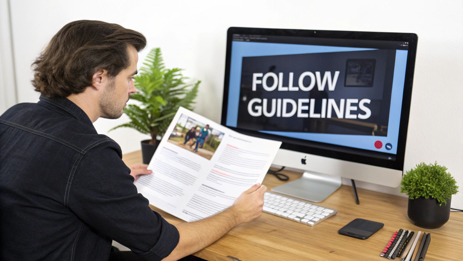
YouTube is very direct about what’s not allowed. If you cross the line, you could see your thumbnail removed, get a strike against your account, or in the worst-case scenario, have your channel terminated. Knowing exactly where those lines are is fundamental to your long-term success.
Deceptive Imagery and Misleading Content
This is the big one: classic "clickbait". Your thumbnail absolutely must be an honest preview of what’s in your video. Promising some massive, dramatic event that never actually happens or showing an item that isn't featured is a surefire way to break viewer trust and violate YouTube's policies.
For instance, using a picture of a huge explosion for a video about simple kitchen tips is obviously misleading. On the other hand, a thumbnail with a slightly exaggerated facial expression reacting to a real moment in the video is usually fine. It enhances the emotional tone without being dishonest. It’s a fine line, but the difference is between sparking curiosity and telling a lie.
Sensitive and Graphic Content
YouTube has very strict rules in place to protect its community from harmful or shocking images. This means your thumbnail must be completely free of:
- Nudity or sexually suggestive content: This is one of the quickest ways to get a thumbnail pulled.
- Hate speech: Any image that promotes discrimination or violence against people is strictly forbidden.
- Violent or graphic images: You can't show serious injuries, gore, or extreme violence in your thumbnails.
- Harmful or dangerous acts: Thumbnails featuring activities that could result in serious physical harm are also a violation.
These guidelines aren't new. Back in 2012, YouTube introduced specific rules targeting inappropriate thumbnails, making it clear that content quality and accuracy were just as important as the technical details. As the platform's algorithm has grown smarter, it now rewards creators who play by these rules, because it prioritises genuine engagement over cheap clicks.
At the end of the day, a successful thumbnail works within the rules to build excitement, not to shock or mislead. A great design respects both the viewer and the platform, making sure your content gets seen for all the right reasons.
Another common pitfall is copyright. Using images you don’t have permission for can lead to takedown notices. To steer clear of trouble, it's vital that you learn how to check image copyright and stick to licensing rules.
How to Create the Perfect Thumbnail in 5 Simple Steps
Knowing the technical specs is one thing, but actually putting them into practice is where the magic happens. Let’s walk through a repeatable, hands-on process for creating a professional-looking thumbnail that ticks all the boxes. We’ll use a popular and free tool like Canva for this example, but the principles apply everywhere.
Having a clear workflow takes the guesswork out of the equation. It means you can consistently produce high-quality thumbnails that not only look fantastic but also get the clicks you’re after. This process is designed to be quick, efficient, and seriously effective.
1. Set Up Your Canvas Correctly
Before you even think about dropping in an image or adding text, your first move should always be to set up your digital canvas to the perfect yt thumbnail size. Getting this right from the start prevents any weird stretching, cropping, or quality loss down the line.
In Canva, it’s as simple as clicking “Create a design” and selecting “Custom size.” From there, just punch in 1280 pixels for the width and 720 pixels for the height. This instantly gives you a blank canvas with the correct 16:9 aspect ratio, meaning your design is optimised for YouTube from the get-go.
2. Choose a High-Quality Background
The background is what sets the entire mood of your thumbnail. It needs to be relevant to your video’s topic, but not so cluttered that it distracts from the main event. A high-resolution image is absolutely non-negotiable here; a blurry, pixelated background is one of the fastest ways to make your video look amateur.
Grab a crisp, compelling still from your video footage or find a high-quality stock photo that fits the vibe. A great tip is if you plan on adding text, consider using a background that’s slightly blurred or has a dark overlay. This will help your words stand out and be instantly readable. Clarity is the goal, not chaos.
3. Add a Clear Focal Point
Every single brilliant thumbnail has one thing that grabs your attention immediately. This is your focal point—the element that draws the viewer’s eye in that split second you have to win them over. More often than not, this is either an expressive human face or a key object at the heart of your video’s story.
For instance, a gadget review video might showcase a sharp, clean shot of the product itself. A reaction video, on the other hand, would almost certainly use a close-up of the creator’s face mid-gasp or laugh. Place your focal point front and centre, perhaps using the classic “rule of thirds” to create a composition that’s more dynamic and pleasing to the eye.
4. Write Bold, Readable Text
Think of your thumbnail text as a mini-headline. It’s there to add context, spark curiosity, or create intrigue that the image alone can't quite manage. The secret is to keep it short, punchy, and incredibly easy to read. You should be aiming for 3-5 powerful words at most.
Use a thick, bold font and pick colours that create a strong contrast with your background. Think bright yellow text on a dark blue background—it’s far more effective than, say, light grey text on a white one. Never forget that a huge chunk of your audience will see this on a tiny mobile screen, so readability is everything.
Key Takeaway: Your text needs to be understood in less than a second. If someone has to squint or pause to figure out what it says, you've already lost them. Simplicity and contrast are your two best friends here.
5. Export for Quality and Size
Okay, you've designed a masterpiece. The final hurdle is saving it correctly. You need to strike the right balance between fantastic image quality and a manageable file size, because YouTube caps thumbnail uploads at under 2MB.
Thankfully, tools like Canva make this super easy. When you’re ready to download your work, choose either JPG or PNG as your file type. Honestly, both are excellent choices. JPG files often give you a smaller file size while retaining great quality, making them ideal for hitting YouTube's requirements without any fuss. Once it's saved, you're ready to upload the video to your YouTube channel and pair it with your perfectly crafted thumbnail.
Frequently Asked Questions About YouTube Thumbnails
Even when you know all the rules, some practical questions always come up when you’re deep in the creative process. Let's tackle some of the most common ones I hear from creators so you can get unstuck and back to making great content.
Think of this as your quick-reference guide for those moments you need a straight answer, fast.
Can I Use a 1920x1080 Image for My YouTube Thumbnail?
Yes, you definitely can. An image that’s 1920x1080 pixels is perfectly fine because it maintains the all-important 16:9 aspect ratio, just like the recommended 1280x720 size. YouTube will handle the scaling for you, so you won’t see any strange stretching or black bars.
Starting with a higher-resolution image can sometimes give you a slightly crisper final result. The only thing you absolutely have to watch is the file size. No matter what, your final export must be under the 2MB limit. Honestly, for most people, designing at 1280x720 from the start is just simpler—it keeps you well within the size limit without any extra faff.
What Is the YouTube Thumbnail Safe Area?
While "safe area" isn't an official term you'll find in YouTube's documentation, it's a vital concept every creator needs to understand. It’s basically the central portion of your thumbnail that is safe from being covered up by YouTube's own interface.
Think of the corners as risk zones. The bottom-right corner is the biggest offender, as YouTube almost always places the video duration timestamp there. Other icons, like "Watch Later," can also pop up over the corners.
To play it safe, keep your key elements—like your face, main subject, or crucial text—away from the edges, especially that bottom-right corner. Centring your design’s most important information is the best way to guarantee it’s seen by everyone, on every device.
Does Changing a Thumbnail Affect an Old Video's Performance?
Absolutely. In fact, it’s one of the most effective ways to revive a video that’s not performing as well as it should. If you have an older video with a low click-through rate (CTR), a redesigned thumbnail can be a complete game-changer. You can find this data by digging into your analytics on YouTube.
A fresh, eye-catching thumbnail sends a signal to the YouTube algorithm that your video has been updated. This can prompt the algorithm to start showing it to new viewers. Many top creators make a habit of going back and refreshing the thumbnails on their underperforming videos. It’s a simple tweak that can lead to a massive surge in views and bring forgotten content back to life. A great example of this is the finance channel The Plain Bagel, which has publicly shared data on how updating old thumbnails dramatically increased CTR and resurrected views on videos that were years old.
Ready to stop guessing and start creating viral video ideas? Vidito is an AI-powered platform that helps you generate and validate content concepts with real data. Find your next hit video, generate click-worthy titles, and design stunning thumbnails all in one place. Start creating with Vidito today!